Alewerks’ Chesapeake Pale Ale
Alewerks Chesapeake Pale Ale Packaging
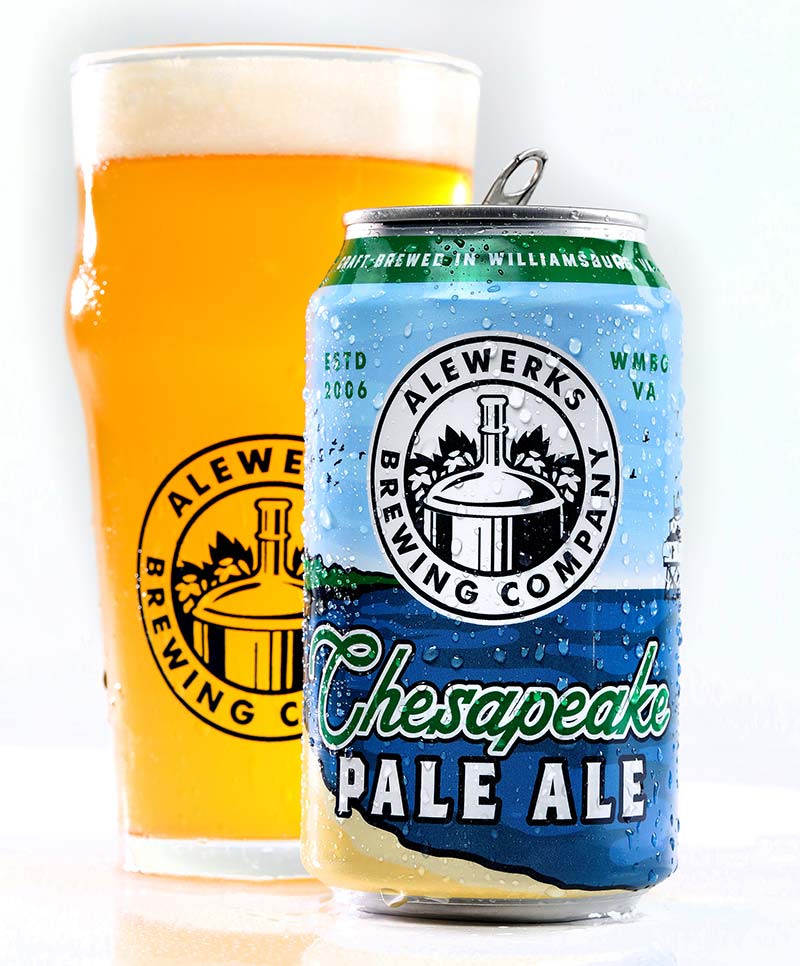
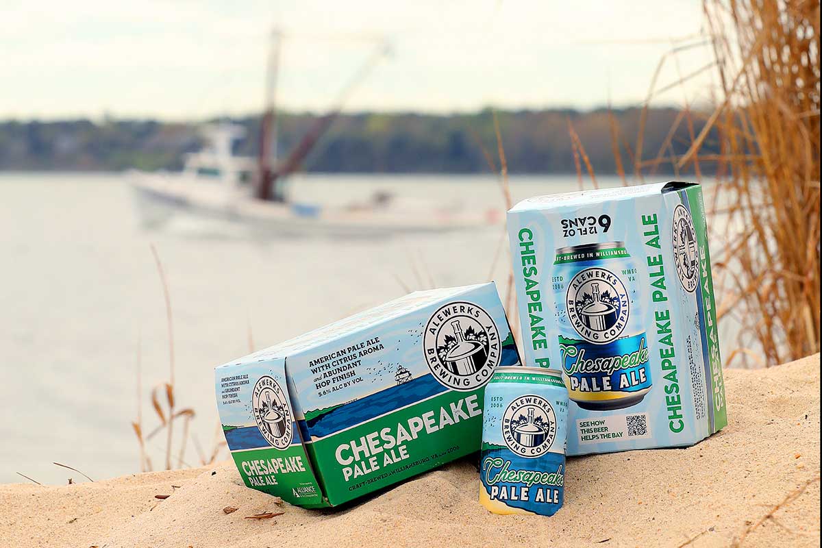
Consociate’s design of Alewerks Brewing Company’s new Chesapeake Pale Ale packaging is a harmonious blend of regional symbolism, and modern aesthetics. The result is a visually captivating and strategically crafted package that not only stands out on the shelves but also engages consumers, inviting them to experience the rich story behind Chesapeake Pale Ale.
Beer with a Purpose
Alewerks partnered with the Alliance for the Chesapeake Bay in an effort to heighten awareness of their cause; for the first time ever, proceeds from the sales of Chesapeake Pale Ale would directly benefit the Bay and all of its natural resources. The time was right for a complete redesign of the packaging, as this coincided with Chesapeake Pale Ale being offered in cans, not bottles, for the first time as well.
Inspiration was drawn from the Chesapeake itself: the color palette is a subtle play of oceanic blues and greens, evoking the calm waters of the Chesapeake Bay, and an illustration inspired by the Thomas Point Shoal Lighthouse, one of the most recognizable in the Bay, helps to anchor the imagery to the Chesapeake and the local region.
Dynamic Label Layout
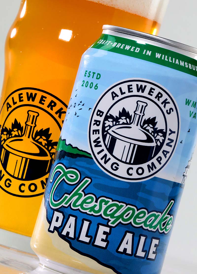
The dynamic and asymmetrical label layout breaks away from Alewerks’ conventional design template for its year-round brews distributed throughout all corners of the Commonwealth. This not only adds a modern touch but also allows for more creative freedom, creating a visually dynamic presence on the shelves.
Typography
The typography is carefully crafted to strike a balance between readability, familiarity and eye-catching artistic flair. The beer’s name is prominently displayed with a font that captures the essence of the brand with a touch of calligraphy to add a sense of craftsmanship and a feeling of yesteryear.
All About That Shelf Appeal
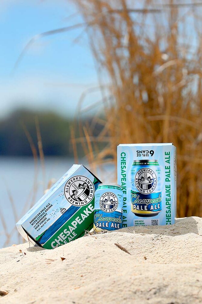
The box design seamlessly integrates various elements of the can design to create a cohesive and visually striking presentation that stands out on a shelf. The dynamic design provides distributors and wholesalers the opportunity to create unique and eye-catching case stacks.
