Stinson Vineyards
Stinson Vineyards, one of Virginia’s most acclaimed wineries, came to us with a clear vision: an evolved brand identity that honored their legacy and would propel them into the next phase of their journey – one that included more premium wines with a heightened focus on estate-grown fruit from their mountainside vineyard. For those familiar with Stinson, it had to feel like the place and the people that run it. For those not familiar, it had to entice you to visit, as well as accurately represent the quality of the liquid contained therein.
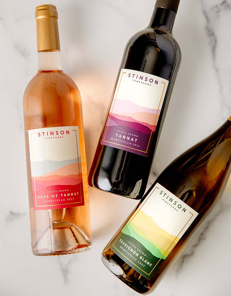
The Labels:
A Tapestry of Terroir
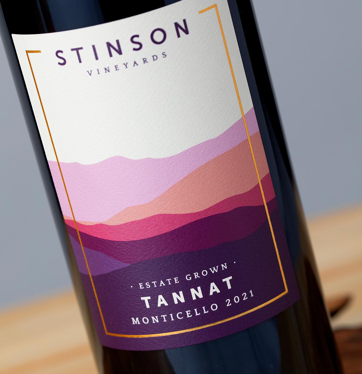
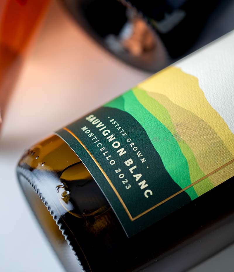
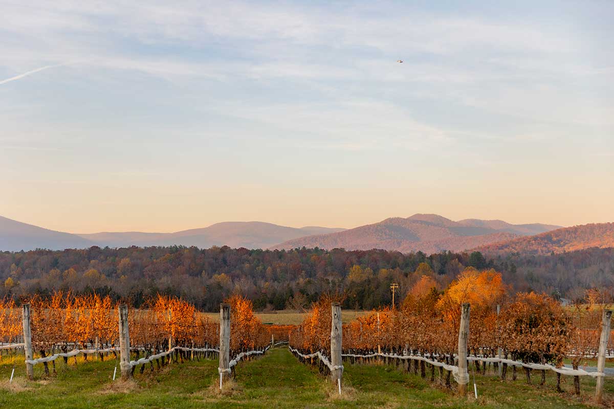
Inspired by the breathtaking views of the Blue Ridge Mountains and the ever-changing colors of the seasons, each label is a visual ode to the unique terroir that shapes the world-class wines at Stinson Vineyards.
The subtlety and complexity which define the wine in the bottle inspired the creative direction for the labels. Often, “more” is seen as superior when it comes to design. One might guess the same can be said when it comes to wine, too. Not here. Not for this special vineyard. Like its experience – both in person and with the wine – the power is in the intent, the details and in the space.
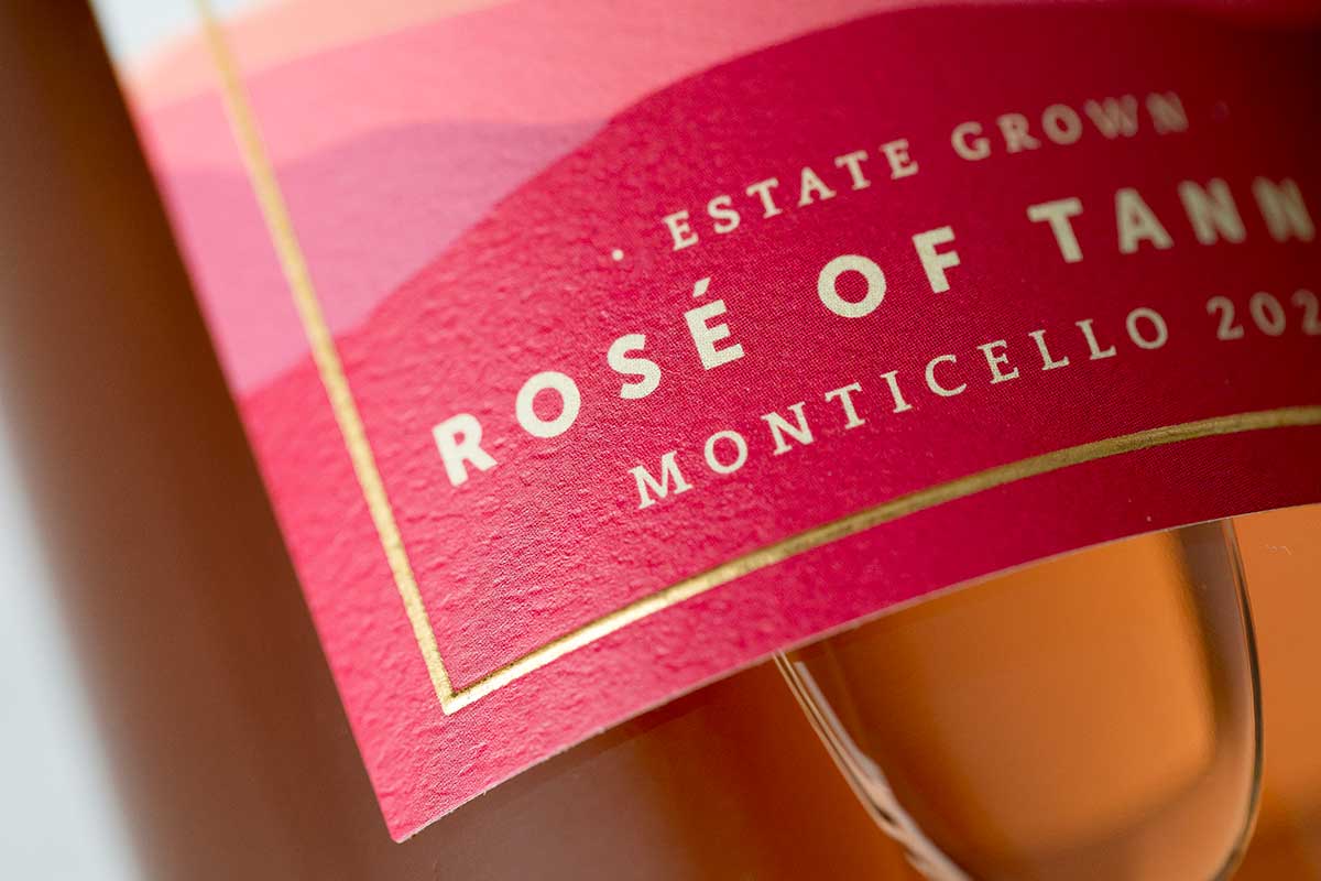
Rosé: a celebration of the rebirth of spring and the vibrant energy of summer. Inspired by the soft pinks and blues of blooming flowers and sun-soaked skies.
White: enchanting shades of greens and yellows embody the freshness and vitality of summertime, blooming vineyards, and golden grape clusters.
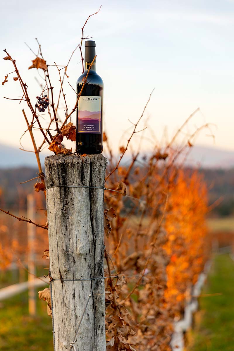
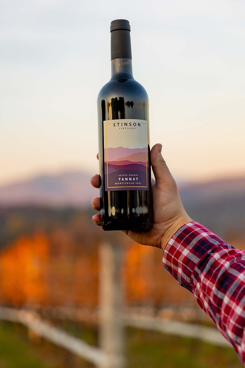
Red: the warm hues of purple and tans that dance across the vineyard and the mountains during autumn are captured in this label and honor the richness of the season and the wines inside.
The Logo: Striking and Strong
In a world of noise, both visual and aural, sometimes the answer is to strip away everything that’s unnecessary and get to the heart of the matter.
This logo does just that. Consociate took the existing Stinson identity and stripped it down, pushing for an abstraction of not only the building, but the winery itself. The result is striking and strong, an iconic rethinking of an established identity.
The garage from their existing logo was reduced to the roofline. The removal of the window moves the graphic beyond just a roofline; it can now symbolize the garage, the mountains that surround the winery, the journey of winemaking (which is never in a straight line), or even the idea that Stinson wines represent the peak of quality. By removing any identifying characteristics, the line is able to become its own icon, referencing the building, but moving beyond it.